Product Design, UX Research | Q2 2024
Advocating for parents of all backgrounds to support their child care needs
challenge
The childcare crisis in America is a frustrating experience for all parents. Seattle in particular is especially difficult for single parent, low-income, and immigrant families as it is one of the most expensive cities to raise a child in. While affordable childcare options exist, it is not easy to find this information; making it all the more frustrating for parents and care givers to navigate since many families aren’t aware that this resource is available to them. Offering better pricing transparency to users in a childcare app is essential making the search for childcare equitable for all families.
solution
Raise is a mobile app that provides easy access to information regarding available child care options in Seattle. Users can compare types of care, pricing, and locations that meet the unique needs of their family. Additionally, there is a chat function so parents can directly contact the child care provider to schedule tours or ask questions.
Research
We interviewed soon to be first time, first time, and experienced parents with different care needs in Seattle. They all expressed frustration and a sense of being overwhelmed with the process of finding quality care that is affordable and right for their family’s needs. Existing child care apps often do not offer price transparency or any indication that there is financial assistance available. The cost of care in Seattle is expensive and beyond what many families can afford ranging from $14,300 - $20,370 annually per child in 2023.
User Pain points
1) Convenience: Seattle’s CCAP offers reduced childcare rates to qualifying families. By indicating whether or not a child care provider is a qualifying participant of the program, families can quickly narrow down their list to relevant providers.
2) Price Transparency: Daycares rarely offer pricing transparency and often fluctuate in price with hidden waitlist costs. While pinpointing exact pricing can be challenging, offering general information would help caregivers get a better understanding while getting more detailed information as they get further in their decision making.
3) Availability: Knowing which care options have openings would help caregivers save time or make a more informed decision when deciding if they want to continue pursuing a care option.
4) Location: Care is often listed which can be overwhelming and difficult to visualize. Providing a map with care locations makes it easier for caregivers to choose locations that are convenient for them.
problem statement
Jessica is a pregnant 30 year old looking for quality and affordable daycare for her future child that works with her schedule.
User Journey Map
Paper Wireframes
Information architecture
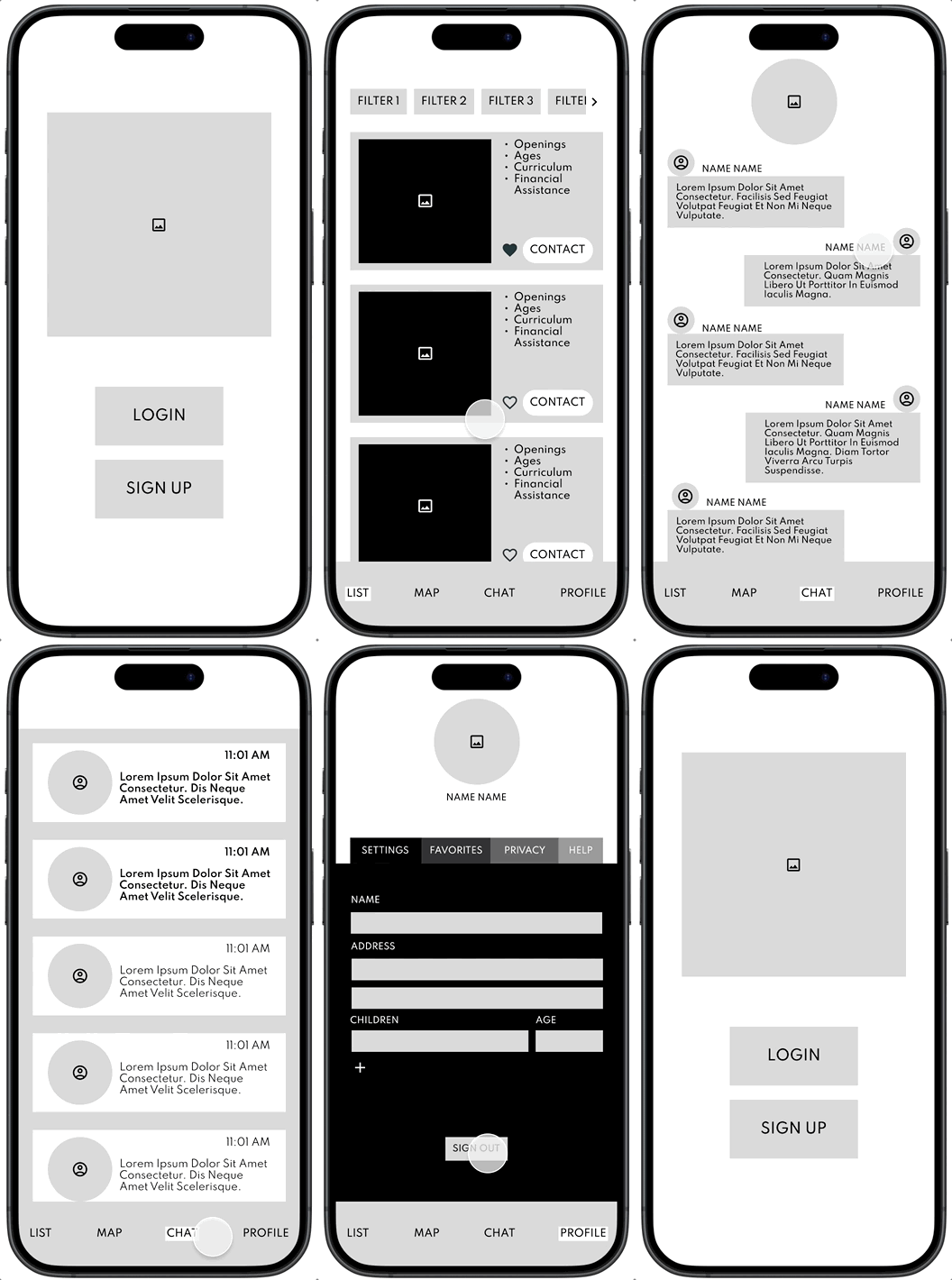
Lofi Prototype
usability study
A lofi prototype was tested with 4 users. While the overall experience was well received, 50% of users wanted the option to login/sign up with a social account to save time. All users called out a need for the name of the care center in the list view. The visibility of a financial assistance option was well received by most users.
hifi prototype
outcomes & learnings
Using the results from the initial usability test, social login/ sign up was added as well as the names of each care center added to the list view in the hifi prototype. Another round of usability studies were done once the hifi prototype was completed. Most users wanted to include more filters for the list and map view. Users also requested more information regarding the CCAP program. Updating the social buttons to appear after the login or sign up was selected would be better to prevent any confusion. I would also add a view that offers side by side comparison of the favorited care centers so users could have a better way to compare options.


